Why Pastel Sneakers Rule Spring and Earth Tones Dominate Fall: The Seasonal Color Shift Explained

The sneaker world operates on its own calendar—one dictated not by product drops alone but by the subtle pull of the seasons. As winter thaws into spring, a soft wave of pastel hues washes over sneaker releases, from powdery pinks and mint greens to butter yellows and lavender. Then, as the heat of summer fades into autumn, the palette deepens into robust earth tones: burnt oranges, olive greens, rich browns, and muted ochres. This cyclical shift is more than a marketing gimmick; it reflects deep psychological and cultural patterns that connect color to mood, environment, and identity. Understanding why pastel sneakers dominate spring and earth tones own fall reveals how sneaker fashion becomes a wearable response to the world around us.
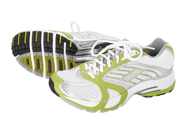
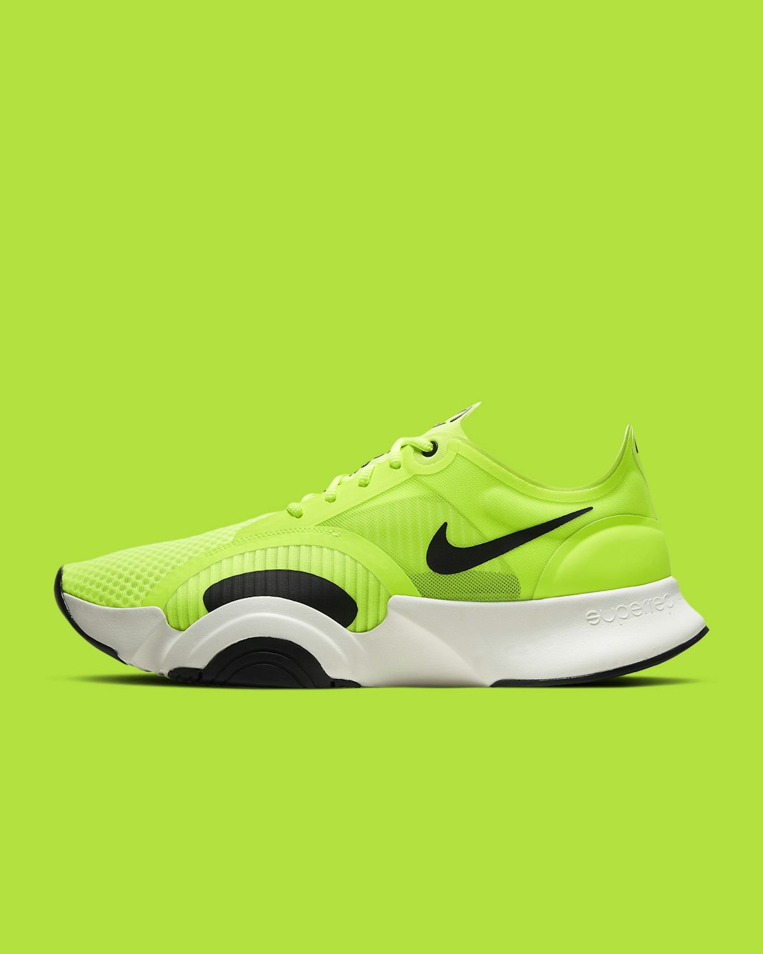
Spring pastels tap into a universal need for renewal. After months of gray skies and heavy layers, the first pastel sneaker of the season feels like a visual exhale. The softness of these colors—often desaturated, airy, and light—mirrors the budding blossoms and cleaner light of early spring. In fashion psychology, pastels are associated with calmness, optimism, and gentleness. A pair of mint Nike Air Force 1s or blush New Balance 990s doesn’t just match the cherry blossoms; it signals that the wearer is open to freshness and play. For sneaker collectors, spring releases are often the most anticipated for their novelty. Brands like Adidas and Asics regularly drop limited-edition pastel colorways that sell out within hours, not because the silhouette is new, but because the hue captures the fleeting energy of the season. The pastel sneaker becomes a statement piece that stands out against neutral spring wardrobes—think cream trousers, light denim, and linen shirts—making the shoe the focal point of an outfit. This is a deliberate design choice: pastel sneakers are inherently photogenic, and in an era of social media sharing, they drive engagement precisely because they feel both nostalgic and current.
Fall earth tones, by contrast, draw on a completely different emotional register. As leaves turn and temperatures drop, the human eye craves warmth and stability. Earth tones—terracotta, camel, forest green, charcoal brown—ground an outfit. They borrow from the natural landscape: the bark of trees, dried grasses, wet soil. In sneaker design, these colors often appear on more rugged silhouettes: trail runners, retro hiking boots, and chunky dad shoes. The Salomon XT-6 in a moss green or the Nike ACG in a burnt sienna speaks to a desire for durability and connection to the outdoors, even if the wearer is simply walking city streets. The psychology behind earth tones is one of comfort and reliability. They are low-contrast, easy to pair, and forgiving of dirt and wear—practical qualities for a season of rain and mud. Moreover, earth tones have a timeless quality. While pastels can feel ephemeral (a pink sneaker might seem dated after a single season), a well-chosen olive or taupe shoe can anchor a wardrobe for years. This is why many collectors view fall releases as investment pieces—they hold resale value better and integrate seamlessly into capsule wardrobes.
The interplay between these two seasonal palettes also teaches something about color theory in sneaker styling. A pastel sneaker demands a clean backdrop to shine. White socks, light-wash jeans, and pastel tees create a monochromatic spring look that feels intentional. Earth tones, on the other hand, invite layering. An orange sneaker can be paired with a navy coat, a mustard scarf, and charcoal trousers—the warm tones bounce off cool ones for a rich, multidimensional aesthetic. The best seasonal sneakerheads understand that transitioning from spring to fall isn’t about abandoning one palette for another but about knowing when each hue resonates most. Some even merge them: a muted sage green sneaker—a pastel earth tone—works in both spring and fall, bridging the gap. But the core shift remains powerful. The same collector who eagerly buys a lilac Dunk in April will, by October, reach for a mahogany Asics Gel-Kayano 14. The sneaker tells the story of the season, and the wearer participates in that narrative.
Ultimately, the dominance of pastels in spring and earth tones in fall is not arbitrary. It is a reflection of how humans have always used color to mark time, to signal readiness for change, and to express the mood of the moment. For sneaker enthusiasts, this seasonal rhythm offers a framework for building a purposeful collection. Rather than chasing every drop, one can curate a wardrobe that evolves with the calendar—light, breathable, and hopeful in the spring; warm, grounded, and resilient in the fall. That is the quiet genius behind the seasonal color shift: it turns a pair of shoes into a diary of the year.
Articles